Case Study - A catalogue that made the right products easier to find
Tropik Home needed shoppers to reach the right product range faster. The previous site made it harder than it should have been for people to find the products they were actually looking for.
- Client
- Tropik Home
- Year
- Service
- UX and web design
Live site
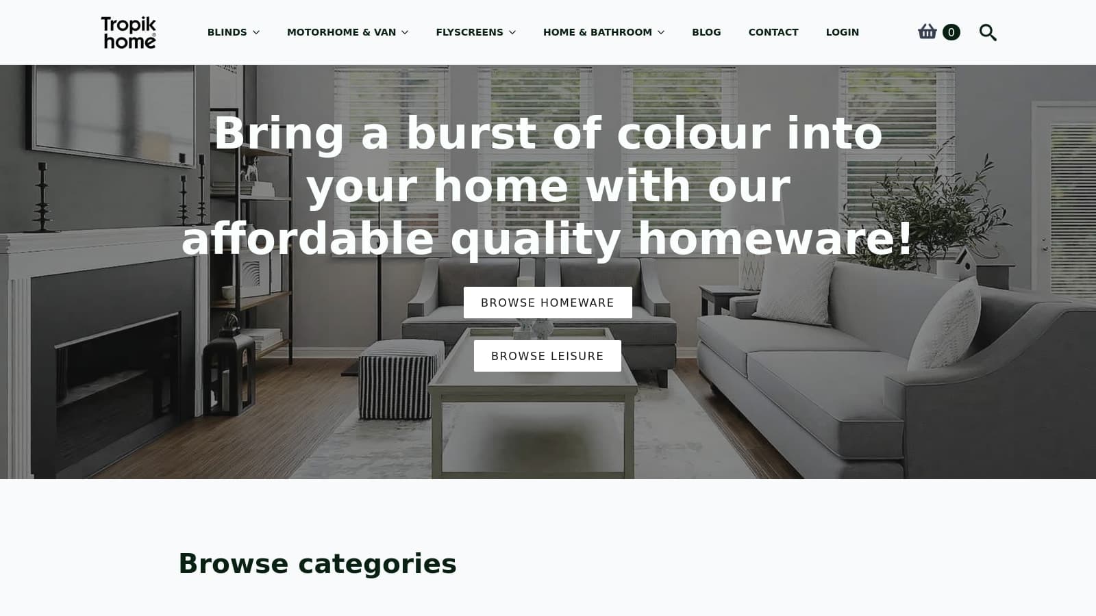
The structural problem
Tropik Home serves several different product families inside one store. The issue was not lack of choice. It was that shoppers could struggle to reach the right part of the catalogue quickly, especially when they arrived knowing the type of product they wanted but not how the store was organised.
Where people were losing time
The old browsing experience asked visitors to do too much orientation work. Instead of helping people find the relevant product line first, it made them sort through routes and page layouts that were not doing enough to narrow the choice.
What we changed
Navigation was rebuilt around the commercial lines already driving the business. Category and product pages were then reordered so fit, compatibility, and selection details appear before secondary content. Support and contact routes were also separated more clearly, so help is available when someone needs it.
What improved
The site now makes product finding simpler. Visitors can choose the right route sooner, compare relevant products with less friction, and reach support without getting pulled back into general browsing.
What became easier for shoppers
- Shoppers reach the right range sooner.
Visitors can tell more quickly whether they need blinds, flyscreens, motorhome and van products, or another route.
- Selection-critical information appears earlier.
Product pages now present fit and buying context before supporting or promotional sections.
- Support and buying routes are less tangled.
Contact and after-sales pathways are easier to reach from relevant points in the product journey.
Top tip
This example is useful when a catalogue has to serve several distinct product types and shoppers are getting lost before they even reach the right category.
- Multi-route navigation
- Category clarity
- Decision-first product pages
- Support signposting
Customers now move from room category to suitable products with fewer dead ends in the browsing flow.